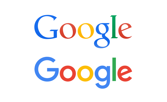
Google has changed its logo

(Image Credit: ARSTechnica)
Well, maybe you noticed that the new Google home page has a new logo on it and paid no mind, but Google themselves have a far deeper reason for the change.
According to Google’s official blog, the reason is because more than just being a search engine that was only available on PCs a long time ago, Google has become a platform for interaction across many different devices and applications today.
The blog went on to explain, “We’re introducing a new logo and identity family that reflects this reality and shows you when the Google magic is working for you, even on the tiniest screens.
As you’ll see, we’ve taken the Google logo and branding, which were originally built for a single desktop browser page, and updated them for a world of seamless computing across an endless number of devices and different kinds of inputs (such as tap, type and talk).’
Watch the video Google shared on how it has evolved over the years below:
The icon to represent Google has also changed from one plain blue G to a 4 coloured G, with the blue, yellow, green and red colours that the log has too.
Google also added that this isn’t the first time they’ve changed their logo and may not be the last, but they just want to embrace how they are making Google work for everyone through their Search, Chrome, Gmail, and Maps platforms.
Digging the new change?


